Redesigning an OCR Invoice Review Tool
Capture is a key internal tool used by OCR review agents to validate invoice data extracted from client invoices. Using the application the team processes thousands of invoices each day, even small usability issues can slow operations and increase errors. Although engineers built the product, its design became a major weakness over time. As the team’s needs evolved, the application fell behind and required a full redesign.

Contribution
What I had a hand in
User Research, UX Audit, Prototype, Ideation, UI/UX Design, Dev Handoff
Team
Who I partnered with
OCR review agents, OCR review team leadership, and the technical lead
Duration
How long we were at it
1 Month
Context: A High-Volume
Invoice Review Workflow
Capture is a key internal tool used to validate invoice data extracted for external clients. The invoice validation team currently processes around 1,000 invoices daily using the tool. Initially, the tool was not designed to handle such a high volume of invoices. As the invoice validation team grew and began processing more invoices each day, it became clear that the application was creating operational challenges. The team recognised the need to modernise both the underlying technology and the interface, and I was brought in to redesign the experience.

Understanding the Problem: Inital Impressions
To kickstart the project, I had a brief call with the invoice validation team. They briefed me on the tool and their workflow. Seeing the tool for the first time, my impression was that it had evolved feature by feature, but its information architecture and layout had not scaled with that growth making it harder for users to complete their work efficiently.
Discovery: Observing Real
Verification Workflows
After our initial discussions, I conducted remote interviews with 5 users in Hyderabad to better understand the process and identify pain points. They walked me through 2-3 real verification cases each while thinking aloud, which helped me document workflows and ask deeper follow-up questions.
This approach helped me understand not just what users did, but why they did it and where the application was not meeting their needs. For example, agents often struggled to connect a field in the form with its corresponding value in the invoice because the interface was visually cluttered and the invoice viewer had limited functionality. I captured these observations and used them to prioritise issues in the UX audit.
After this, I did a UX audit of the application and uncovered numerous issues spanning both design and technical concerns. Technical shortcomings were passed on to the development team, while the design problems were catalogued and ranked by severity (Critical to Low) for prioritisation.

Redesigning the Invoice Validation Screen
From this, I began redesigning the application. The first screen I worked on was the invoice validation screen, which is the most important because this is where agents validated the extracted invoice data and spent most of their time.
Issues Identified
Through analysis of the existing experience and stakeholder discussions, I found the following issues.
The screen suffered from high cognitive load and poor scanability.
Important business fields, low-priority system-generated fields and redundant info were presented with equal visual weight and no order, forcing agents to spend unnecessary effort determining what required attention.
Agents had to manually scan long forms to locate specific fields, slowing down the review process, while dense layouts and weak typography made information harder to read and compare against the invoice.
Design Decisions
A key insight from stakeholder discussions was that agents could work significantly faster if low-priority fields were easier to skip. This insight inspired me to experiment with the layout and come up with data-table-inspired layout that is easy to scan for the agents.
Using card sort, I reorganized the fields around a clear information hierarchy. Related fields were grouped together to reduce visual clutter, while mandatory, and high-priority validation fields were positioned on the top so agents could focus on the most critical information first.
I also leveraged confidence scores to draw attention to extracted values that were more likely to contain errors, helping agents direct their effort where it was most needed.
To reduce time spent searching through the form, I introduced a search capability that allowed agents to quickly locate specific fields.
Typography, spacing, and visual hierarchy were refined to improve readability and validation accuracy, while the overall screen structure remained familiar to minimize retraining and preserve existing user mental models.
Validation screen before vs after (Use slider to interact)
Redesigning the Dashboard
The dashboard was the team's starting point for daily work, but research showed that it did not help agents decide which cases needed priority, nor did it give an overview of the workload.
Key Insights
Prioritisation Bottleneck: I found that while cases arrive in large batches with a strict 48-hour turnaround time (TAT), the dashboard lacked timestamps for case creation or aging. Without this metadata, the team struggled to establish a clear triage process
High Visual Noise: The existing dashboard was cluttered with redundant columns, making it difficult to skim and increasing friction
Missing Core Functionality: Essential functions, specifically, global search and advanced filtering, were completely absent, forcing manual navigation
Missing Overview: Important metrics that could help agent decide workload were missing from the dashboard
Inefficient Self-Assignment: Although agents frequently pulled tasks from the team queue, the lack of a streamlined self-assignment mechanism forced them through a complex, multi-click navigation path.
Design Decisions
Keeping these points in mind, I redesigned the dashboard to support the agent in the workflow. I added case creation timestamps, simplified redundant columns, introduced global search, and designed filters for case status, priority, and client. I also added metrics and merged team work queue and agent work queue in single page for simple and easy navigation.
Dashboard before vs after (Use slider to interact)
Designing Admin Configuration
While redesigning the platform, I uncovered a key gap beyond the invoice validation workflow. Administrators lacked the tools to manage client configurations independently and frequently relied on engineering teams for updates and maintenance tasks. To address this, we designed a comprehensive admin console that enabled self-service management of client fields, auto-learning configurations, reporting, and system settings, thus giving administrators greater control while reducing operational overhead for technical teams.

Form Builder View (Admin Configuration)
Introducing Smarter Validation Nudges through Auto-Learning
To reduce repetitive validation errors, with the help of data science team we implemented an AI-driven auto-learning system that learns from historical user corrections. The system identifies recurring extraction and validation issues and helps the agent with contextual guidance at the moment of review.
For instance, if reviewers consistently update the vendor GSTIN because the OCR engine confuses similar-looking characters (such as "O" and "0"), the system recognises the pattern and proactively highlights the field for verification on future invoices from the same vendor. This helps reviewers identify issues proactively and helps in reducing errors directly


Example of Smarter Validation Nudges through Auto-Learning
Design Patterns & Small Wins
Across the redesigned workflows, I also standardised feedback patterns so agents could better understand system status and the result of their actions
Submit toast messages to confirm successful task completion.
Copy feedback to confirm when text was copied.
Field states for error, autofill, edited, and informational conditions.
Standardised data table patterns for scanning, sorting, and filtering.
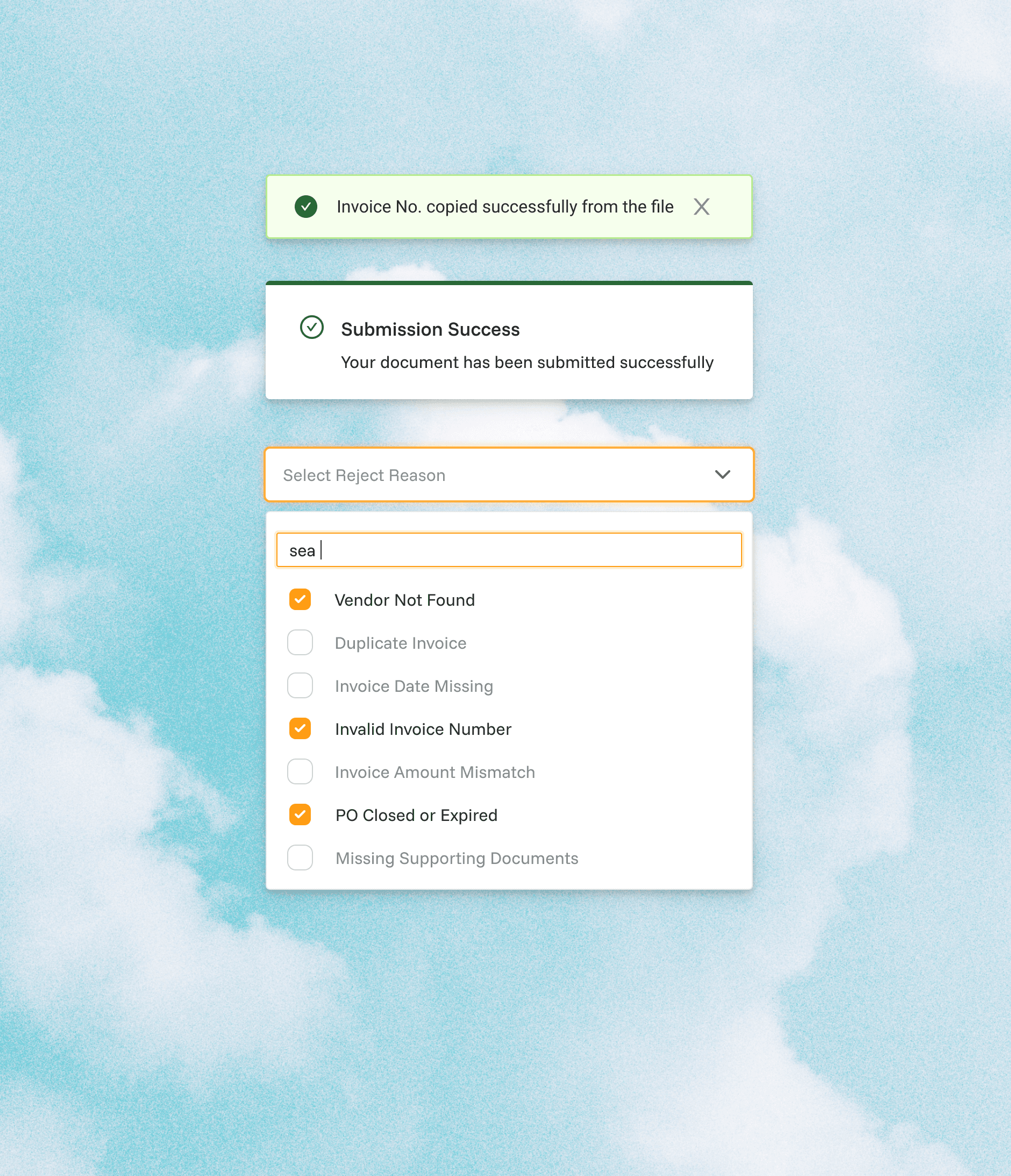

Optimizing Usability via Micro-UI Patterns
Outcome
Within one month, I delivered a clean and redesigned workflows for invoice validation, case prioritisation, and admin configuration. The redesign reduced visual noise, improved scanability, introduced clearer field states, and gave agents faster ways to find, validate, and correct invoice data under strict turnaround times.
The Application is under development right now. We are expecting a 50% efficiency, I could share the actual metrics once the development is complete and team start using the application.
We are tracking the following metrics: measuring speed, validation accuracy, and SLA compliance.
